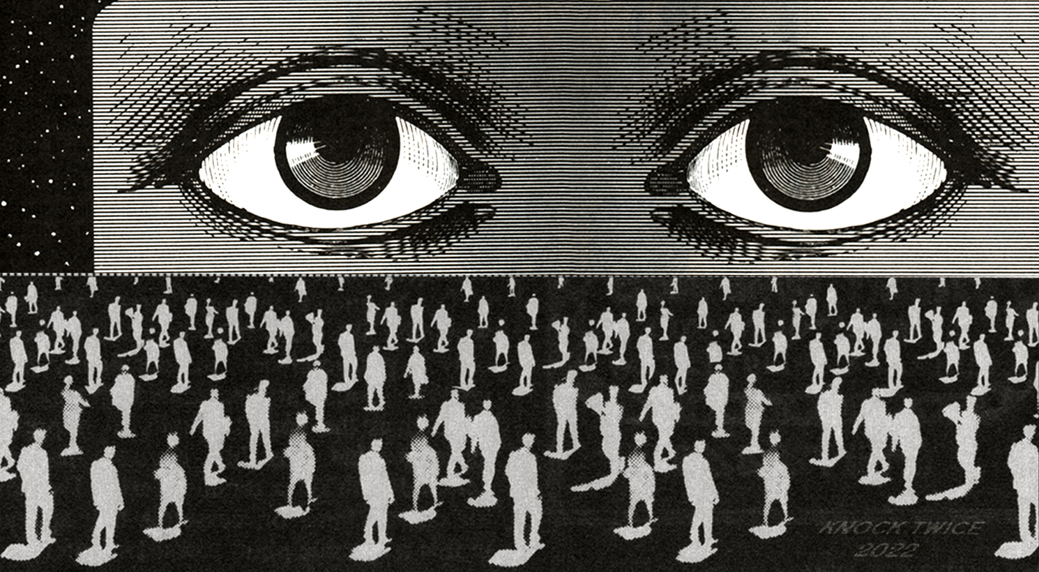
For the follow-up event to showcase and sell graphic tees from Knock Twice, I designed a special sticker that captured the essence and vibe of the event. This sticker was created by scanning elements from vintage magazines, then manipulating and positioning them to fit the aesthetic of our unique venue setup.
The main portion of the design features the eyes at the top half, representing the Knock Twice logo, while the large crowd at the bottom symbolizes the attendees of the event, commemorating the occasion perfectly. The sticker’s design encapsulates the nostalgic and dynamic atmosphere of our event, making it a memorable keepsake for all who participated.
This creative process not only highlights my skills in digital manipulation and design but also reflects the dedication to maintaining a cohesive and engaging brand aesthetic for Knock Twice.